Turning hiring overwhelm into clear tasks
Hireology | Lead UX Designer
Project Context
Hireology supports hiring teams managing multiple roles, candidates, and stakeholders at once. As the platform matured, complexity increased alongside feature depth, particularly for hiring managers responsible for day-to-day execution.
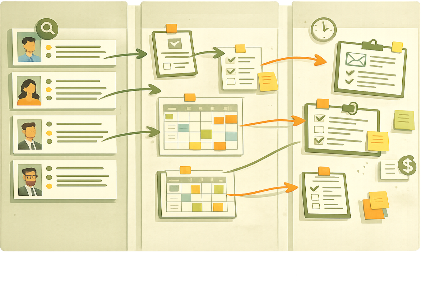
The project began with an unexpected internal discovery: our own hiring team was not using Hireology to manage their hiring work. Instead, they relied on an external Kanban board because the platform felt overwhelming when juggling multiple roles and responsibilities. Tasks were technically supported, but cognitively fragmented across dashboards, job pages, and candidate views.
How might we help hiring managers understand and prioritize what needs their attention when hiring work is fragmented across multiple jobs and workflows?
My Approach
I started by validating whether this was an isolated internal issue or a systemic one:
Partnered with Customer Support to review call themes and Salesforce cases
Analyzed NPS responses, where “hard to navigate” consistently surfaced
Audited recorded customer sessions, which showed users repeatedly looping through dashboards to complete basic tasks like reviewing resumes
To understand users’ mental models, I facilitated a lightweight workshop with customers during Hireology’s annual summit. Using a task-based card sorting exercise, participants grouped hiring activities in ways that cut across jobs, candidates, and stages.
The pattern was clear: users thought in terms of tasks that needed action, not entities that needed navigation.
This re-framing aligned stakeholders around a new direction: task management wasn’t a surface-level feature, it was a structural problem worth solving.
Key Insights
Assumption: Users mental model is managed by hiring per job
Reality: Users manage hiring by urgency and action required, which bounces between jobs
Assumption: More visibility into the hiring process equals better control
Reality: Too much information creates decision fatigue and paralysis, not clarity
Assumption: A kanban-style design is the best solution to task-management
Reality: Users need prioritization and progression more than visual workflows
Impact
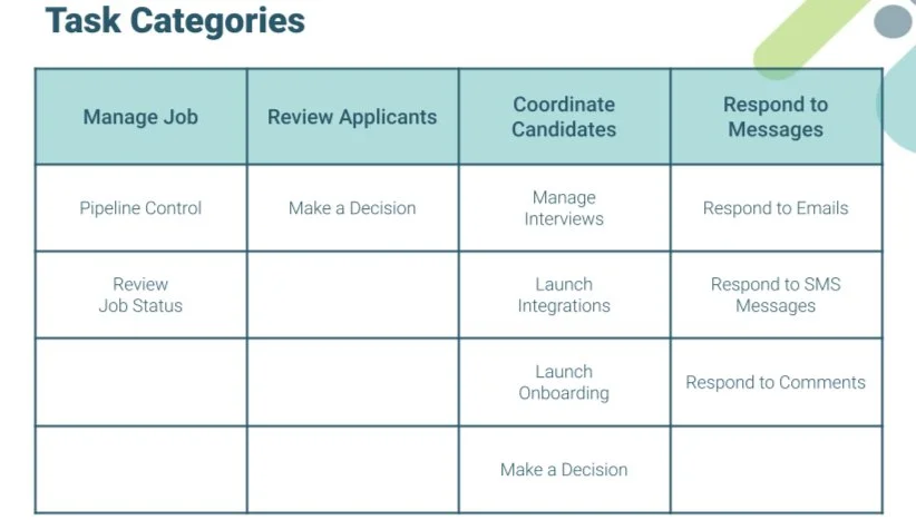
The outcome was a redesigned home experience centered around task categories that reflected users’ mental models, rather than internal system architecture.
More importantly, this work became the conceptual foundation for a broader initiative: a backend overhaul that enabled task-based automation and future workflow triggers.
While the full system required months of additional development beyond my tenure, this project:
Re-framed how the organization thought about task management
Established a shared language between UX, product, and engineering
Unlocked executive support for investing in automation infrastructure rather than incremental UI fixes
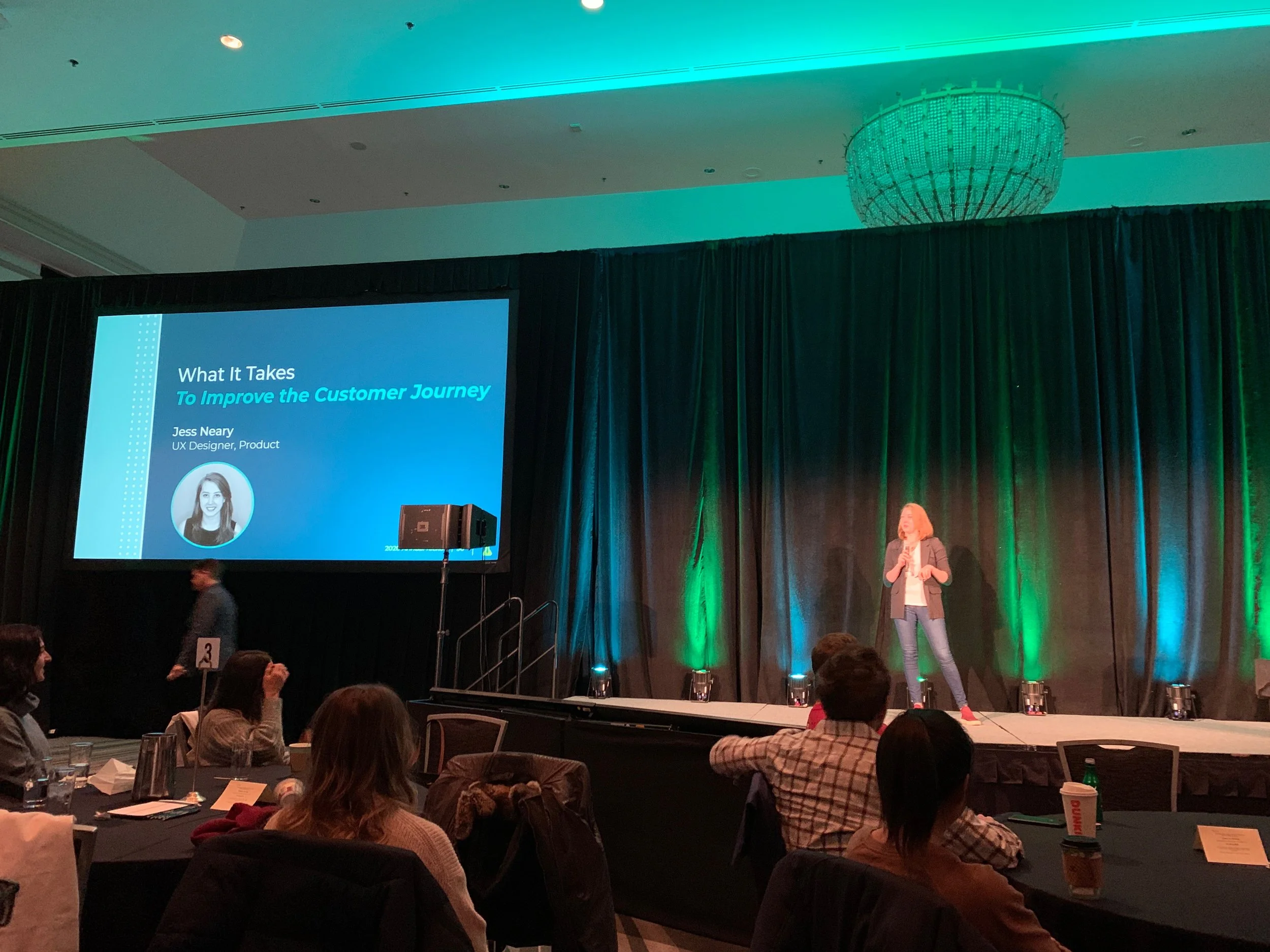
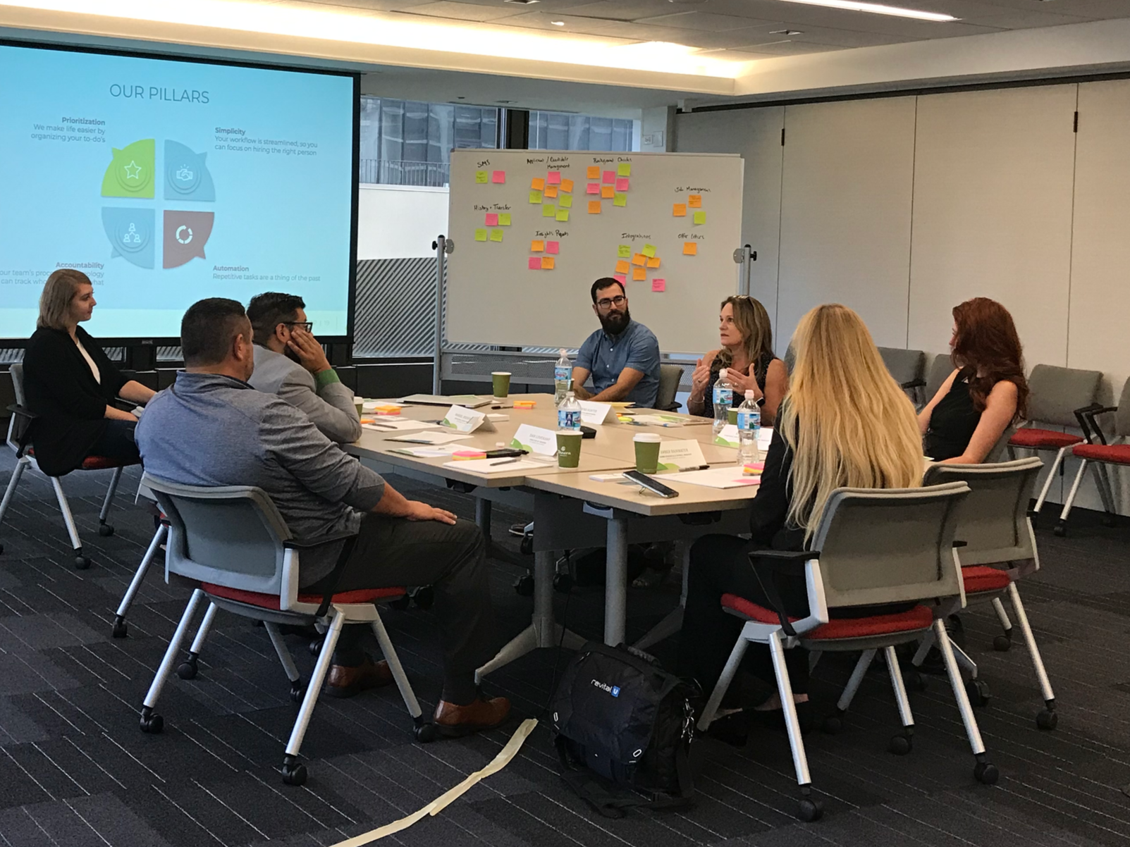
I presented this work to the company as a UX case study, walking through how the problem was re-framed, the research decisions behind it, and the implications for Hireology’s future automation strategy. The presentation helped align product, engineering, and leadership around task-based thinking as a foundational shift, not a feature-level change.
After presenting, multiple teams across product, engineering, and customer-facing roles approached me to better understand how UX research could support their initiatives.